2 The user interface
2.1 Overview
In this chapter, we describe the contents and layout of a standard iSEE app.
Specifically, we focus on the appearance of the interactive point-and-click interface presented to end-users who come to simply explore the data set without any programming knowledge required.
Illustrative screenshots are taken from the iSEE app produced by the example code given in the help page of the iSEE() function, which can be access from an R console by typing either help(iSEE) or ?iSEE.
2.2 Panels
Under entirely default settings, data sets loaded into the iSEE app are automatically parsed for standard information stored in SummarizedExperiment objects. Based on the information available and a set of eight core panel types designed to display different pieces of information, the iSEE() function automatically populates the interface with one panel of each type for which the relevant information is available.
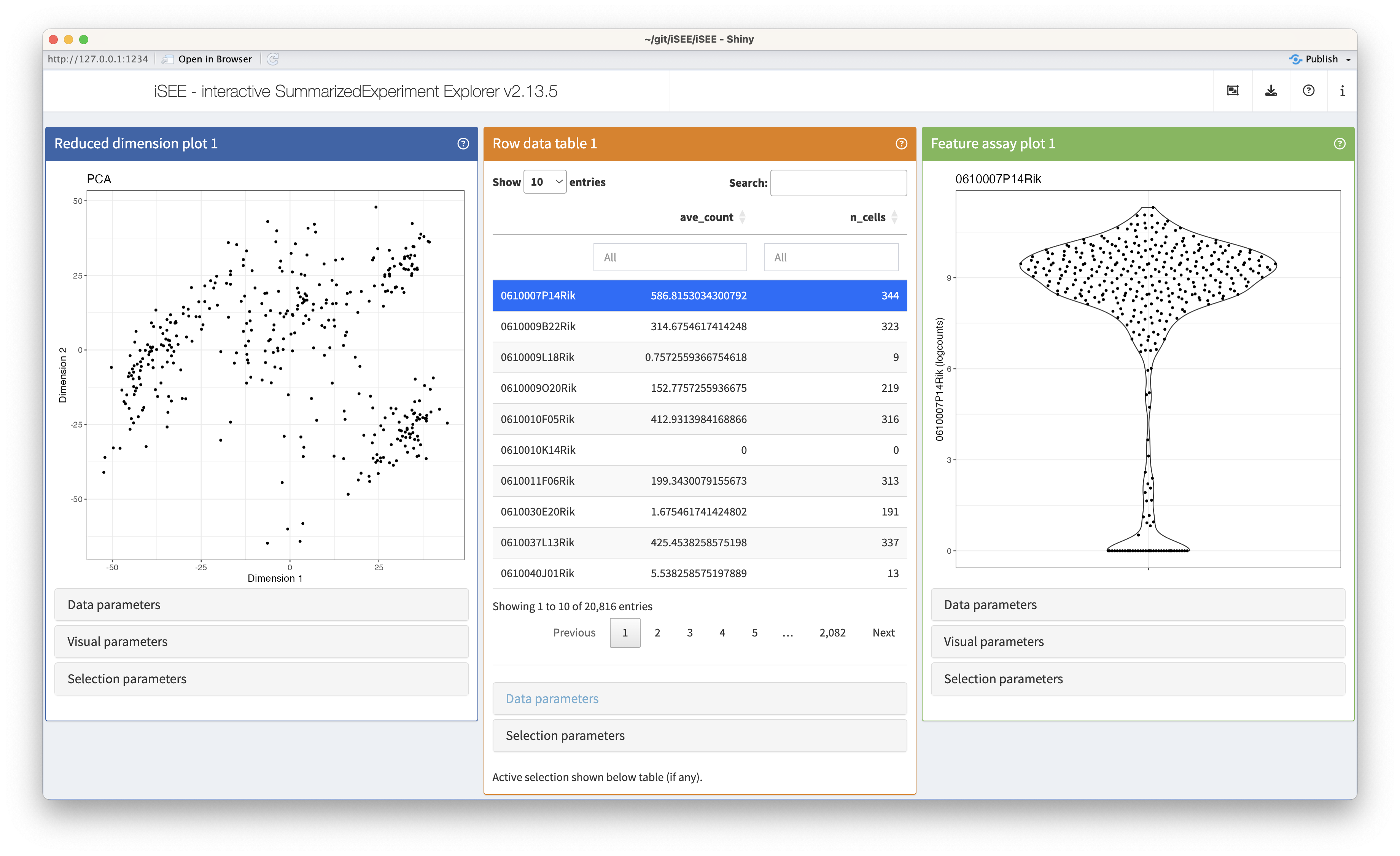
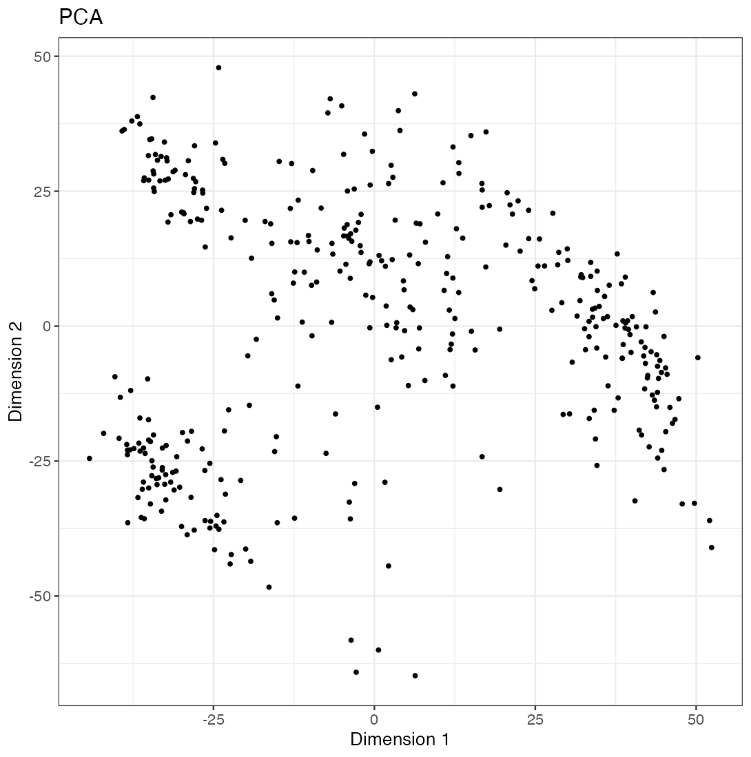
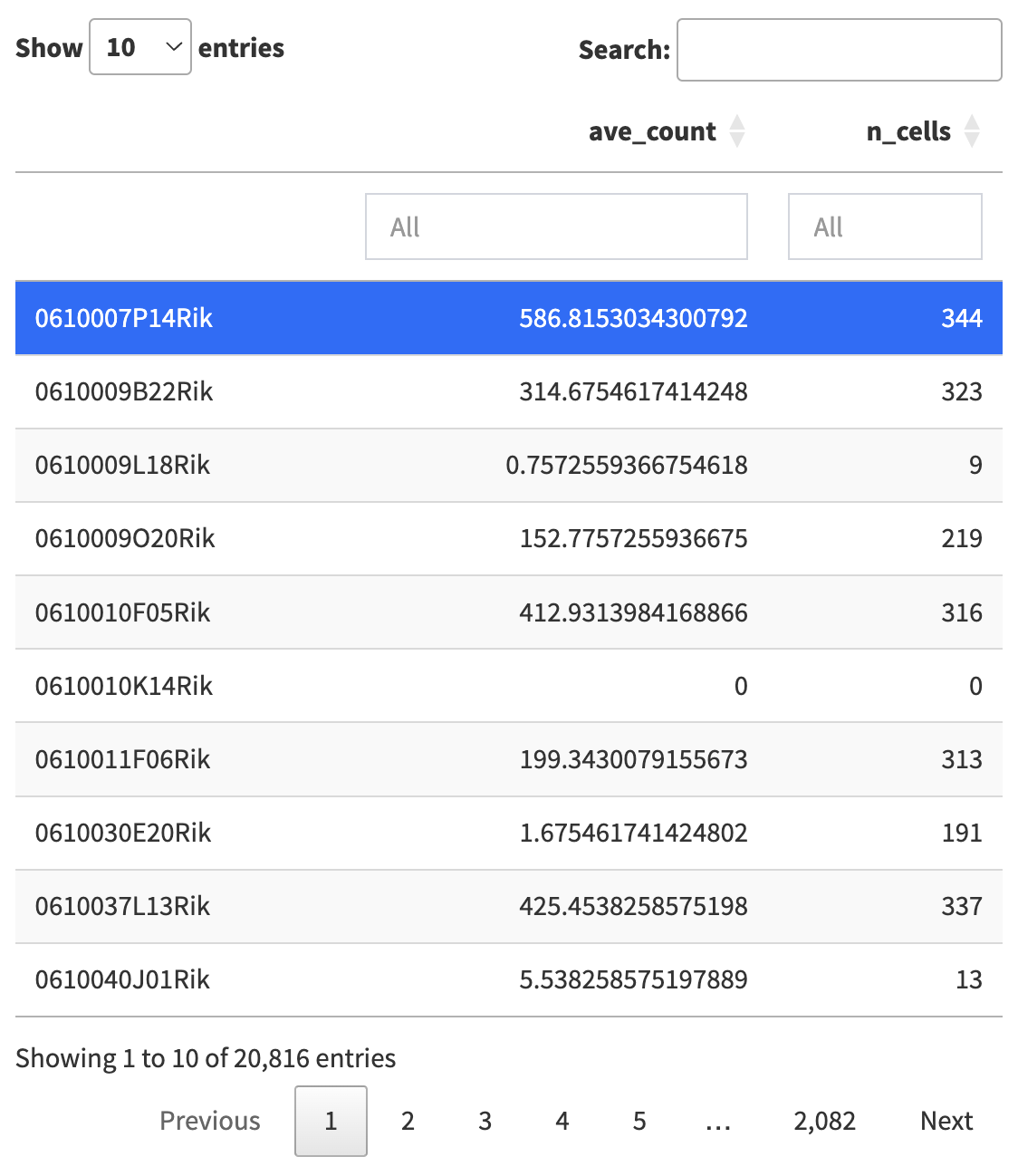
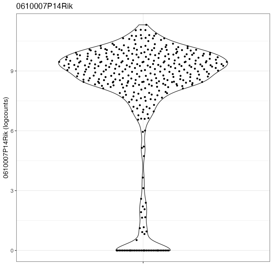
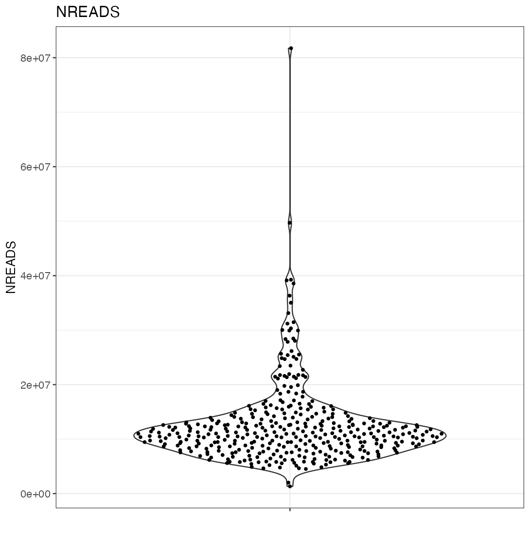
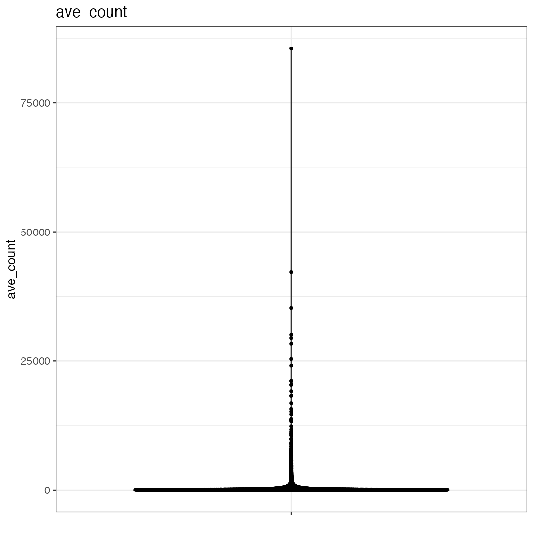
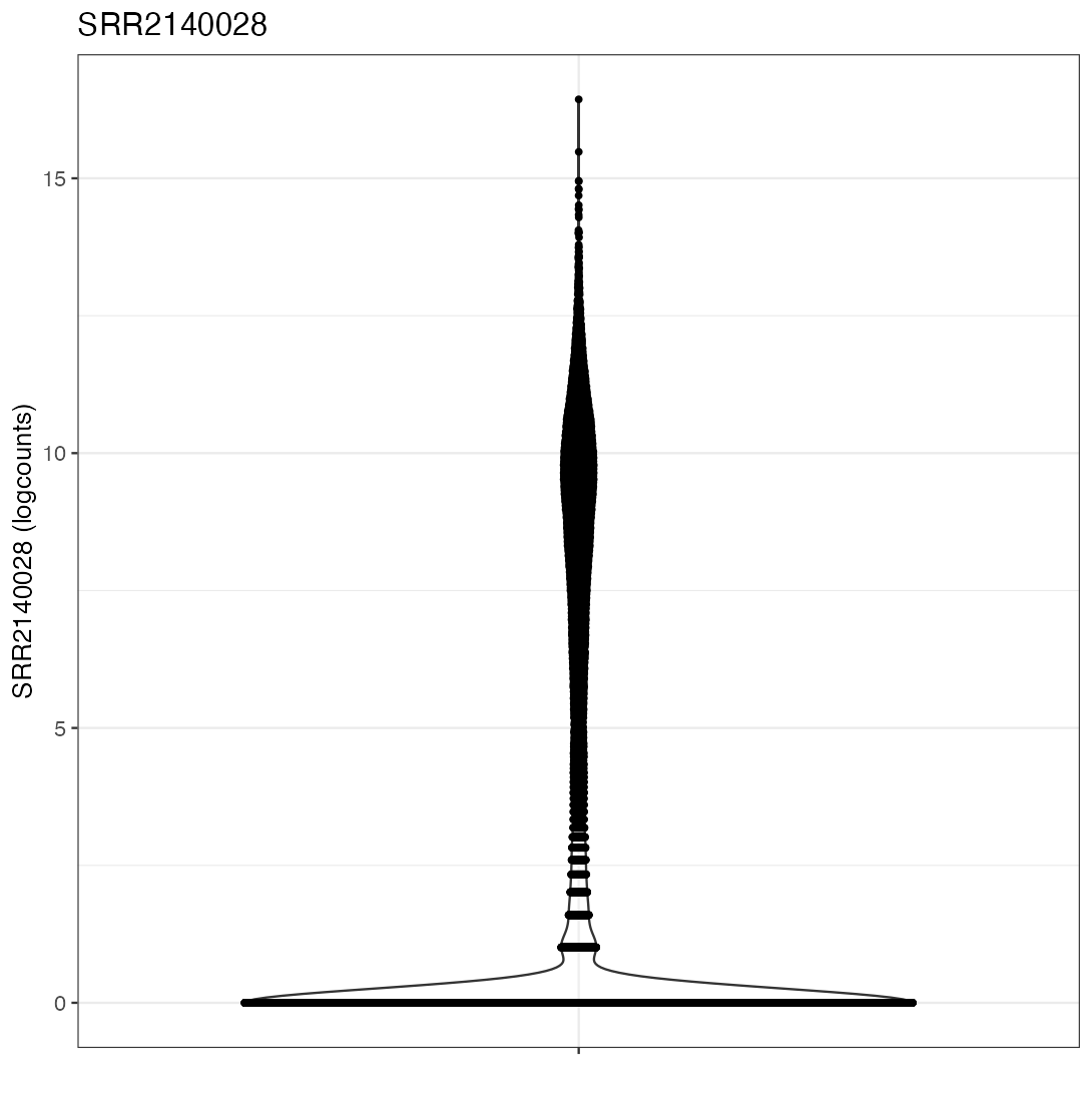
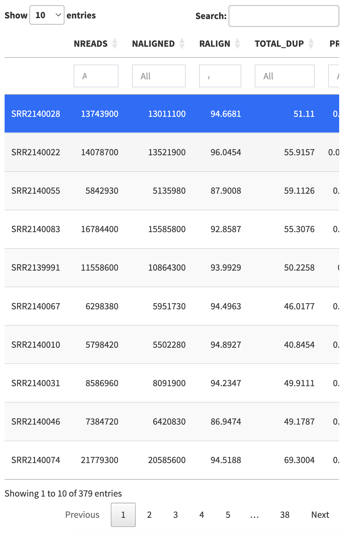
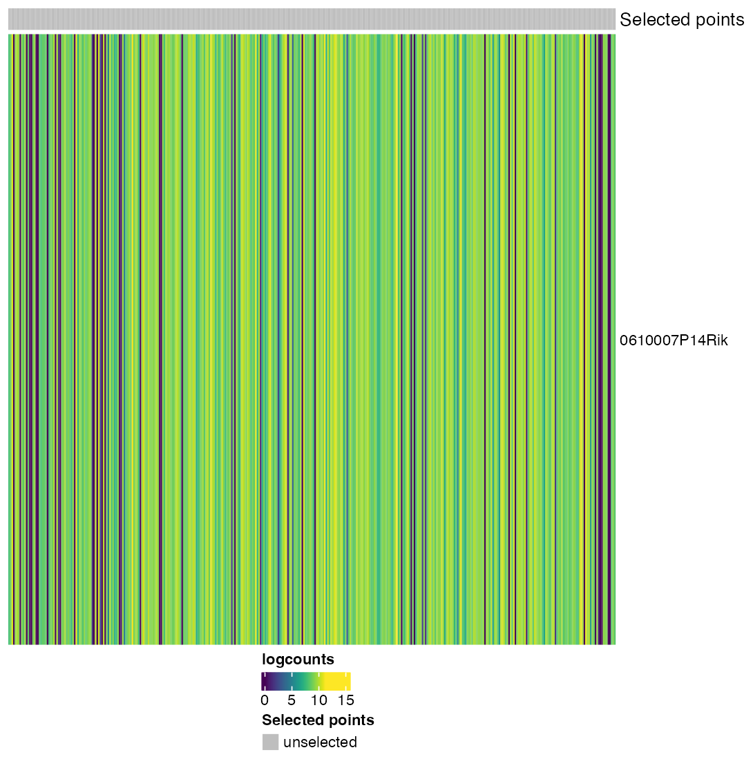
The example code given in the help page of the iSEE() function produces an iSEE app that showcases all eight core panel types. For simplicity, Figure 2.2 displays only the main component of each of those eight core panel types, for an example data set. Additional components accompanying each panel and the purpose of each panel will be discussed in a separate chapter.
2.3 Actions
Once the panels are loaded into the interface, users are free to interact with the interface in any way they see fit.
2.3.1 Scrolling
Use the mouse wheel, trackpad, or directional arrows (up and down), to scroll up and down the interface, to bring panels into view.
Horizontal scrolling is not possible in Shiny apps.
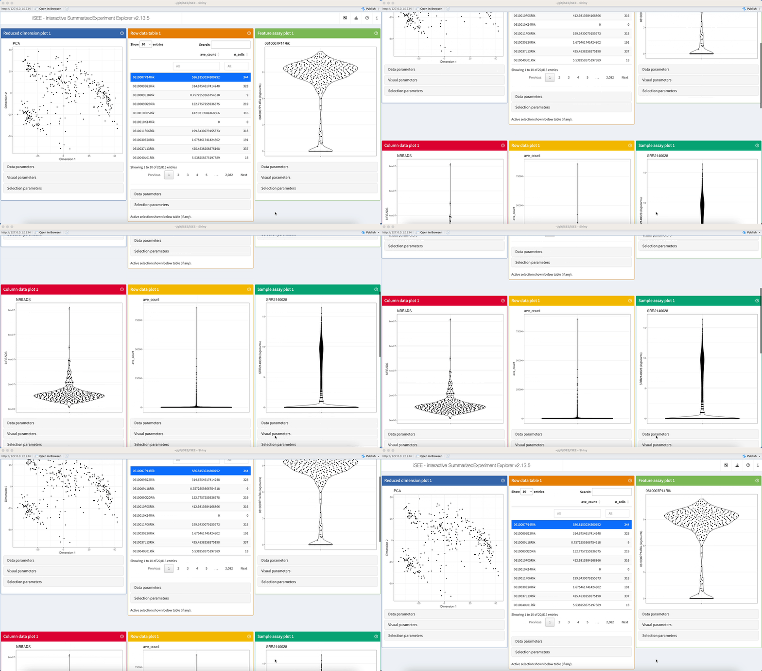
There is no limit to the number of panels that may be added to the iSEE user interface.
Meanwhile, no more than twelve panels may be displayed on a single row – one panel per unit in the 12-unit layout of pages produced by the shiny package – with rows being filled from left to right and panels exceeding the 12-unit layout being placed on new rows.
The 12-unit grid system used by shiny is described in the Shiny Application layout guide.
2.3.2 Collabsible boxes
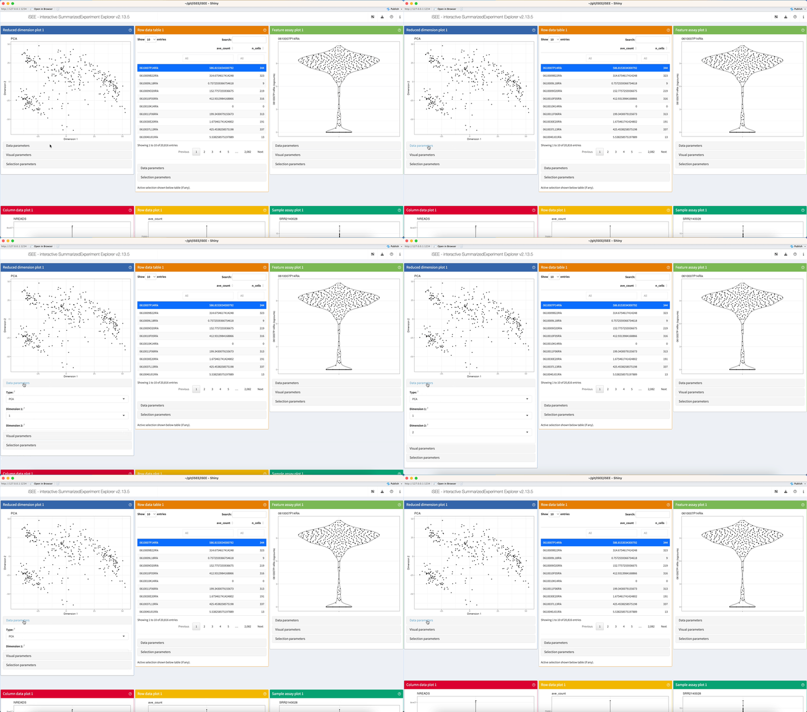
Click on the header of collapsible boxes located under the panel output, to reveal interactive elements controlling various aspects of the contents displayed in each panel.
2.3.3 Selection inputs
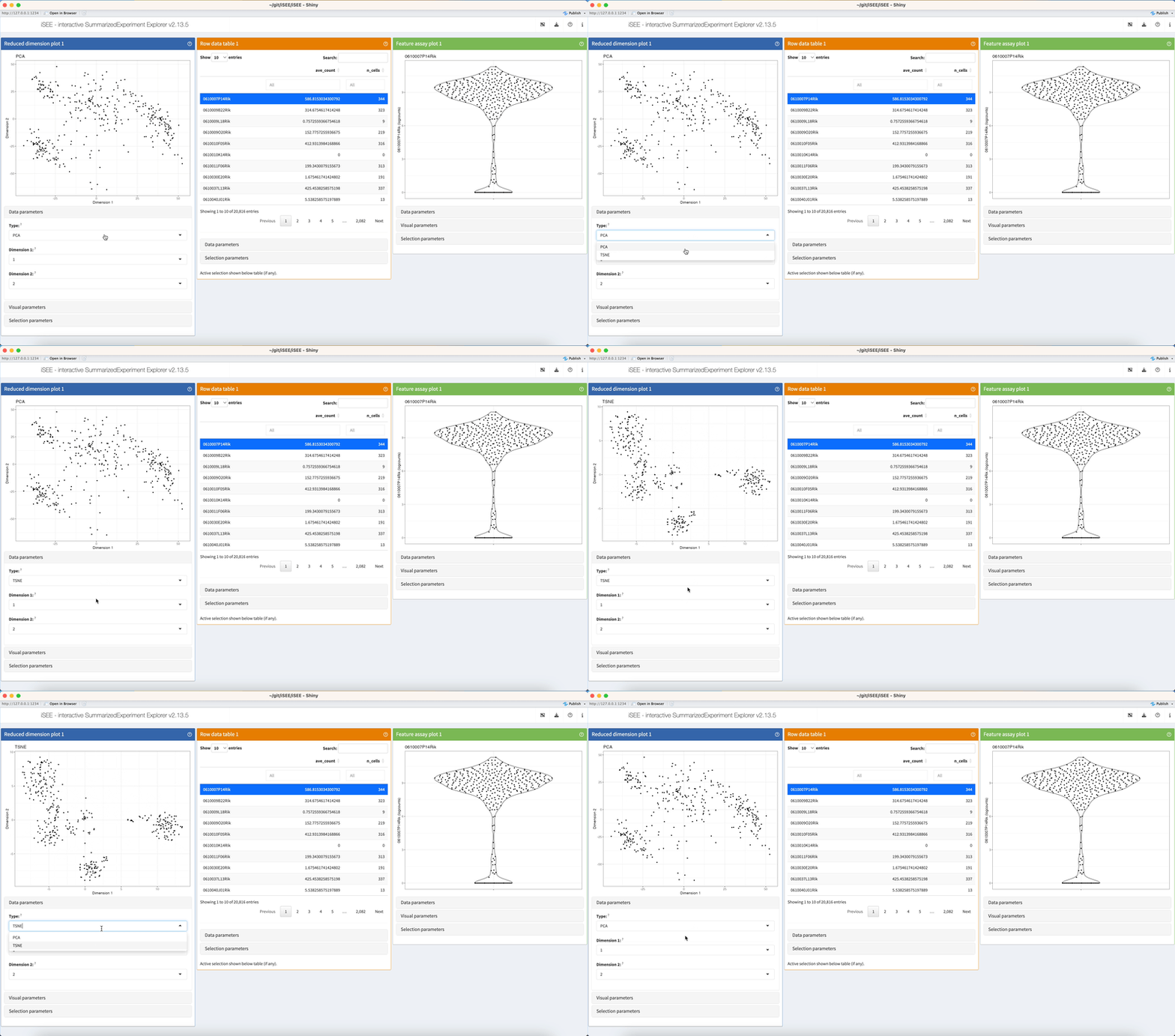
Click on dropdown elements to reveal their choices. Click a different choice to see the panel output change accordingly.
2.3.4 Checkboxes
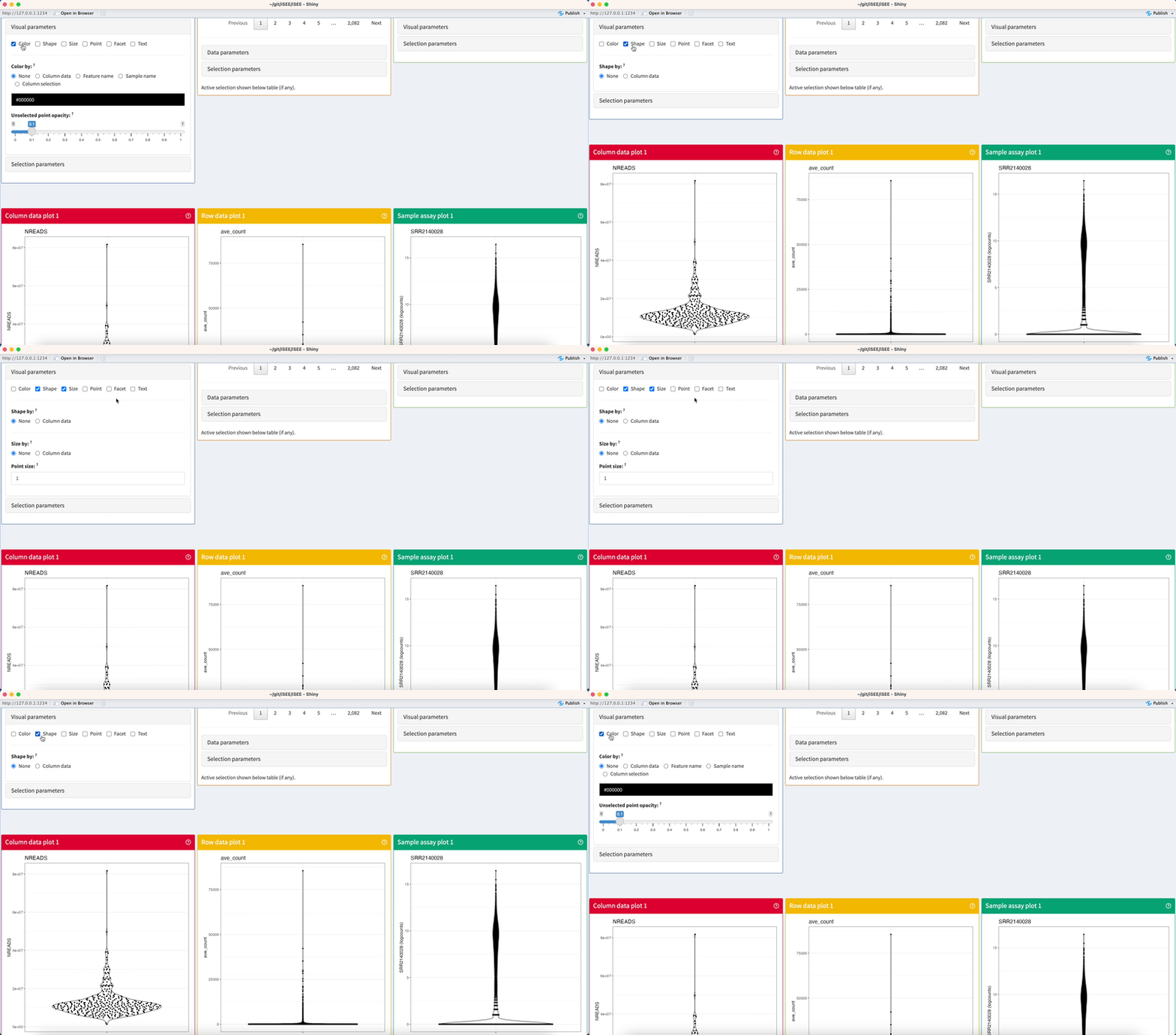
Click on checkboxes to toggle any number of mutually-compatible parameters.
2.4 Collapsible boxes of parameters
2.4.1 Data parameters
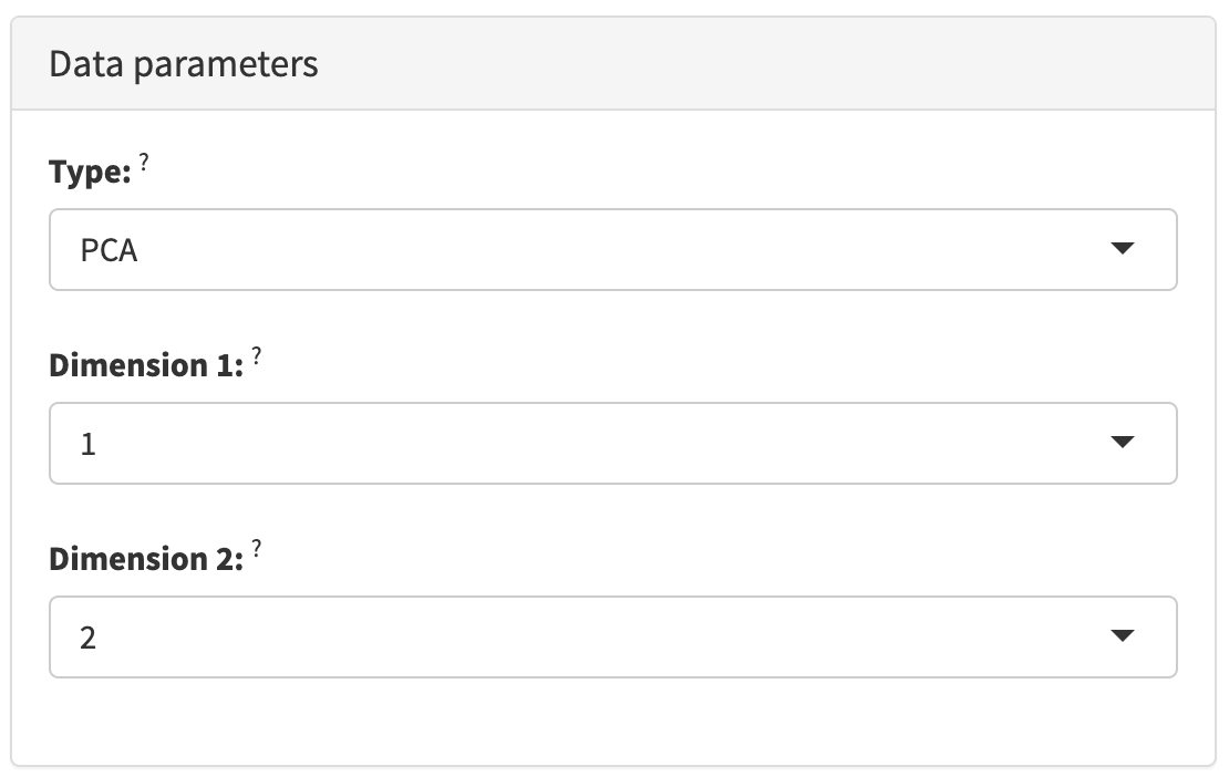
The Data parameters collapsible box contains interactive elements that control the nature of the observations displayed in each panel.
For plots, that is typically the choice of variables shown along each axis.
For tables, that is typically the subset of columns hidden in the panel.
2.4.2 Visual parameters
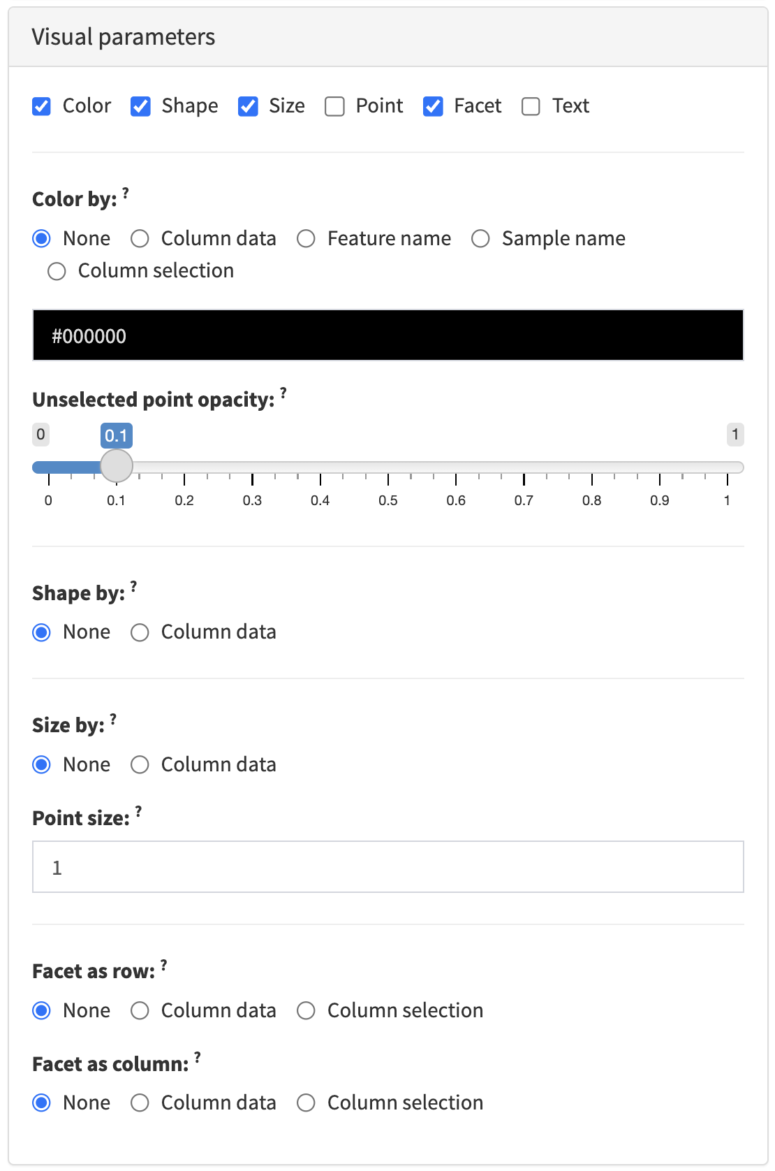
The Visual parameters collapsible box contains interactive elements that control the appearance of data points and non-data elements of panels that produce a plot.
That is typically the color, shape, size, and opacity of data points. It may also include the possibility of faceting the plot by discrete variables along each axis, and further customisation of non-data elements of the plot such as axis labels and the plot legend.
2.4.3 Selection parameters
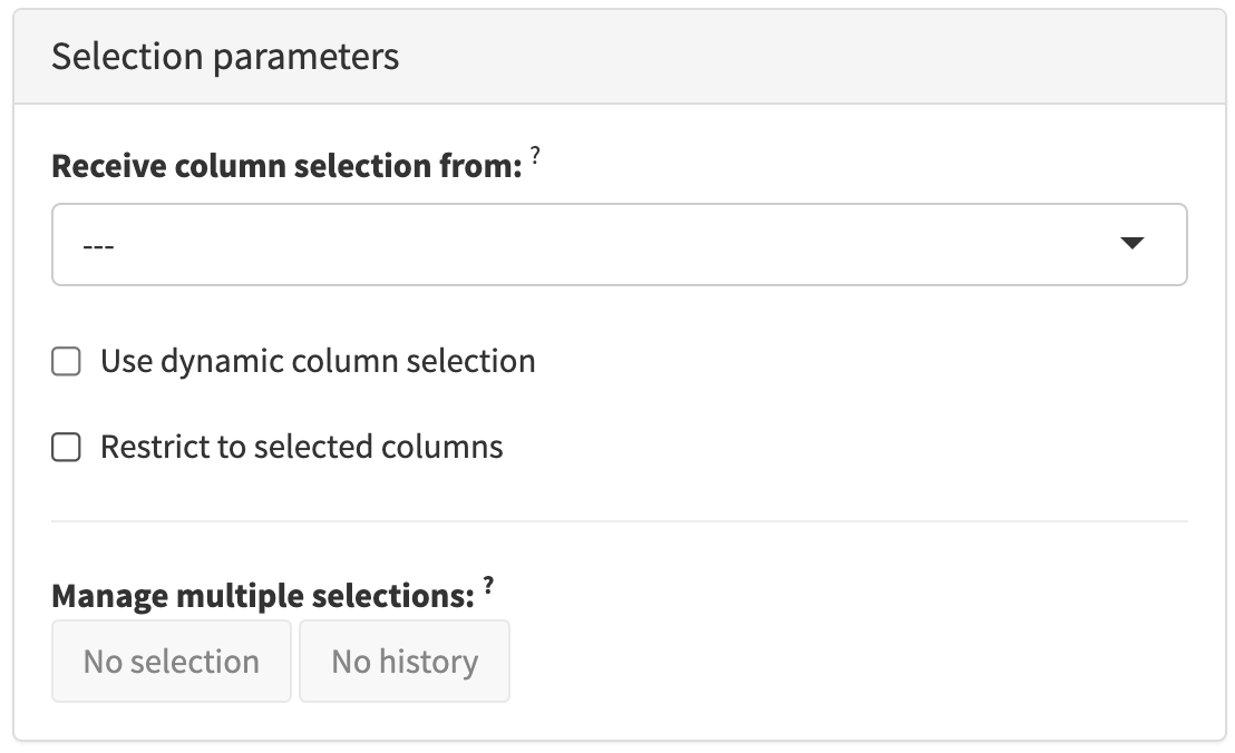
The Selection parameters collapsible box contains interactive elements that control the transmission and usage of selections in each panel.
That is typically the name of another panel to receive a selection from and whether to restrict data points in the current panel to those selected in the other panel It may also include the possibility of saving and deleting saved selections made in the current panel.
